Logos and branding are just meant to be together
In the world of business, when the competition is fierce, a company must stand out from the rest and have a strong brand identity. The logo is often the first thing customers and people in general remember about a brand. This little symbol is used to recognize that brand or company, so having a well-designed one is essential.
Give businesses the confidence to progress beyond all measures using these catchy logo designs


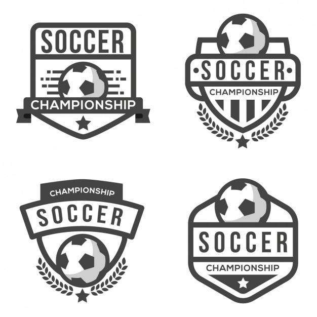


Be the one to design the logo for a successful company
The first thing that helps when it comes to recognizing a brand is, as you’ve probably guessed, a logo. This is very important in graphic design, as it can directly or indirectly affect how a brand presents itself to the general public. Fortunately, there are many useful resources to accomplish this mission.
Increase brand recognition via merchandising and promotional products
Since logos are used for public identification of a certain company or brand, their presence can be extended further. Don’t limit yourself to business cards or signs! You can add them to corporate presentations, slideshows, merchandise, promotional products, and uniforms—just to name a few possibilities.
Power up corporate websites with the use of logos
We live in a digital world, so don’t underestimate the power of the Internet when measuring the presence of a certain brand or company. Corporate websites are the perfect place to include logos and other elements that build brand recognition. If you think of the many applications of a logo when working, success is guaranteed.
FAQ
A logo is a symbol composed of images and text (or sometimes just letters) used to identify mostly businesses but also individuals. The logo aims to explain at a glance what a company does (or its field of operation) and its values.
Depending on the source, the number of types of logos may vary, but there are four that are considered universal. Wordmark: features the company's name shown creatively, usually with a nice combination of colors and typography. Lettermark: this type is similar to the previous one. It works best with monograms, acronyms, or initials, especially in cases where the company's name is too long or difficult to pronounce. It focuses on just letters and colors. Brandmark: Sometimes called pictorial marks, these appear as an icon or an image. Think of Piki’s head in the case of Freepik! Since that image must be associated with the business in question, this kind of logo works best when that business already has a good presence in the market. Combination mark: this is a combination of brandmark and wordmark, usually containing the company's name and icon or image. Since they appear together, these are great for helping the target audience start to identify that icon or image with the company's name so that it ends up laying the foundations for a brandmark.
Answering this question might be difficult, as it can be a subjective matter. If we had to choose some characteristics, these could be totally valid: simplicity, relevance, memorability, notability, versatility and timelessness.
Since Freepik has many logo templates available, you can start from any of them. Locate the one you prefer by using the search box or clicking on the logo category. Download it, open it in your preferred software, and incorporate other elements, such as images or modify the text. Alternatively, you can design your logo online thanks to Wepik and its powerful editing tools.
Related articles

What is a logo? The history and meaning behind these trademarks
Logos are more than just symbols. They are storytelling devices, representing the essence of brands, cultures, and societies.

Principles of design and how to use them
Discover the principles of design and how to use them in your graphic design projects in the best way.

What is a color scheme? Definition and types
Discover what is a color scheme, types, and the importance of using color schemes in art and design.